
The Tyranny of the Timeless
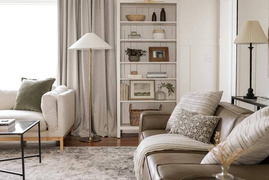
In the ever-churning landscape of home decor trends, one aesthetic has positioned itself as the exception to the rule: neutrality. Content like “Build a Neutral Palette with These Stunning Amazon Home Accessories | Timeless Finds” doesn’t just sell products—it sells an ideological position. It proposes that by adhering to a restricted palette of beiges, grays, whites, and muted earth tones, one can escape the fickleness of fashion and achieve something approaching design permanence. Neutrality is marketed not as a style choice but as a sophisticated transcendence of style itself, a visual philosophy that promises both aesthetic longevity and psychological calm.

This review will deconstruct this powerful cultural narrative. What exactly constitutes the “neutral palette” in 2024, and how has it become Amazon’s home decor lingua franca? What psychological needs does this aesthetic address in an era of sensory overload and digital distraction? Most critically, can mass-produced neutrality—sourced through algorithms and delivered in cardboard boxes—truly deliver on its promise of timelessness, or does it represent a new, particularly insidious form of trend conformity disguised as trend transcendence? We examine how neutrality became a commercial orthodoxy and what alternatives might exist for those seeking genuinely enduring domestic environments.
2. Deconstructing “Neutral”: The Semiotics of Restraint
The contemporary neutral palette marketed through Amazon represents not the absence of color, but a specific, codified color system with its own grammar and vocabulary.
The Chromatic Hierarchy: What passes for “neutral” follows a strict hierarchy:
-
First-Tier Neutrals: Warm whites (not cool), oatmeal, cream, beige, “greige”
-
Second-Tier Neutrals: Putty, taupe, mushroom, stone, clay
-
Permitted Accents: Sage green, terracotta, muted mustard, charcoal
-
Forbidden Colors: Pure white (too stark), true black (too harsh), any saturated hue
This system reflects what color theorist Faber Birren identified as “psychologically safe colors”—those that provoke minimal emotional response and create perceived visual rest. However, the marketed version exaggerates this principle into an aesthetic dogma.
The Texture Doctrine: Since color variation is minimized, texture becomes the primary vehicle for visual interest. The neutral aesthetic relies on what might be called “textural contrastism”: matte against gloss, rough against smooth, nubby against sleek. A typical neutral vignette might include linen, bouclé, unglazed ceramic, and oil-rubbed bronze—all within the same narrow color band.
The Natural Material Fiction: Neutral aesthetics are inextricably linked with “natural” materials in marketing, yet what’s actually sold are simulations: resin that mimics travertine, MDF with oak veneer, polyester that feels like linen. This creates what design philosopher Jane Forsey terms “authenticity theater”—the performance of naturalness through artificial means.
The “Quiet Luxury” Myth: Neutral palettes are consistently marketed under the banner of “quiet luxury”—the aesthetic of old money, discretion, and unspoken quality. Yet most Amazon-sold neutral accessories represent the opposite: conspicuous consumption of the appearance of discretion. As sociologist Juliet Schor notes, “The democratization of luxury often means the luxury of surfaces without substance.”
3. The Algorithmic Neutral: How Amazon Standardizes “Timeless”
The neutral aesthetic’s dominance on Amazon isn’t accidental but engineered through platform dynamics.
The Review Economy Bias: Neutral items consistently outperform colorful counterparts in ratings. This isn’t necessarily because they’re better, but because they’re safer—less likely to provoke strong negative reactions. A beige pillow might earn a bland 4.2 stars; a fuchsia one might polarize reviewers into 5-star lovers and 1-star haters. The algorithm rewards consistent mediocrity over passionate divisiveness, making neutral items more visible.
The Photography Advantage: Neutral products photograph better in varied lighting conditions and against different backgrounds. This gives them an edge in the flattened, two-dimensional Amazon shopping experience where customers can’t experience color in context. As retail psychologist Paco Underhill observes, “Online shopping favors the chromatic middle—colors that look like they’ll match anything because they don’t strongly assert themselves.”
The Bundle Psychology: Neutral items are easier to bundle into “collections” or “room sets.” A retailer can create a “Desert Neutrals Collection” with 15 coordinating items; a colorful palette would be more difficult to coordinate at scale. This encourages the purchase of multiple items, increasing average order value.
The Cross-Listability Factor: A neutral item can appear in more search results: “bedroom decor,” “living room accessories,” “office organization,” “wedding registry.” This maximizes visibility across categories, creating what economists call “search arbitrage opportunities.”
4. The Product Pantheon: Archetypes of Algorithmic Neutrality
The neutral accessories marketplace has developed its own predictable taxonomy.
Category 1: The Textural Prop
Items whose primary purpose is to add texture within the neutral spectrum.
-
Examples: Chunky knit throws in cream, linen-look curtains, bouclé pillow covers, jute rugs
-
The “Timeless” Claim: Natural fibers and simple crafts transcend trends
-
The Reality: Most are synthetic blends with short lifespans; the “handmade” look is machine-made; they yellow or pill quickly
Category 2: The Ceramic Abstraction
Minimalist pottery and vessels that serve as sculptural accents.
-
Examples: Asymmetrical vases, lidded canisters, primitive-style bowls
-
The “Timeless” Claim: References ancient pottery and modernist sculpture
-
The Reality: Often thin-walled, poorly glazed resin; the “imperfection” is manufactured; they chip easily
Category 3: The Woodgrain Signifier
Items that use wood or wood-look materials to add warmth.
-
Examples: Light oak trays, walnut candle holders, bamboo organizers
-
The “Timeless” Claim: Wood is eternally classic
-
The Reality: Often rubberwood (parawood) or bamboo with thin veneers; finishes wear quickly; “live edge” pieces are often just printed patterns
Category 4: The Stone Simulacrum
Accessories that mimic natural stone without its weight or cost.
-
Examples: Resin bookends that look like marble, travertine-look coasters, soapstone-look trays
-
The “Timeless” Claim: Stone has been used in design for millennia
-
The Reality: Plastic with mineral dust coating; scratches reveal base material; often smells chemically
Category 5: The Metallic “Accent”
Restrained metal finishes to add subtle shine.
-
Examples: Brushed brass candle sticks, matte black picture frames, unlaquered bronze hooks
-
The “Timeless” Claim: Metals have enduring appeal
-
The Reality: Thin plating over base metal; finishes tarnish unevenly; “antiquing” is factory-applied
5. The Psychology of Neutral Consumption
The appeal of neutral palettes operates through multiple psychological mechanisms.
Decision Fatigue Alleviation: In a world of overwhelming choice, a restricted palette reduces cognitive load. As psychologist Barry Schwartz documents in The Paradox of Choice, too many options create anxiety. Neutrals offer a pre-curated solution: “Just choose from these safe options.”
The Flexibility Fantasy: Neutrals are marketed as endlessly adaptable—”they’ll go with anything!” This promises future-proofing against changing tastes or circumstances. However, this often leads to what design critics call “the beige prison”—a space so neutral that nothing feels intentional or personal.
Status Signaling Through Restraint: In an era of maximalist Instagram aesthetics, choosing minimalism can signal sophistication. Sociologist Thorstein Veblen’s concept of “conspicuous consumption” has evolved into what might be termed “conspicuous restraint”—displaying taste through what one chooses not to display.
The Calm Promise: Neutral spaces are marketed as inherently calming, referencing research on color psychology. While certain colors do affect mood, the blanket equation “neutral = calm” oversimplifies complex environmental psychology. For some individuals, neutral spaces feel sterile or depressing rather than peaceful.
The Photogenic Imperative: Neutral spaces photograph well in the flat, bright style favored by Instagram and real estate listings. This has created what architecture critic Kate Wagner calls “the Instagram floor plan”—homes designed primarily for two-dimensional representation rather than three-dimensional living.
6. The Sustainability Paradox of “Timeless” Consumption
The marketing of neutral accessories as “timeless” and therefore sustainable deserves particular scrutiny.
The Durability Deception: Items marketed as timeless classics are often made with the same planned obsolescence as trendier items. A “classic linen pillow cover” might be polyester with a linen print, designed to last one season.
The Trend Cycle of Neutrality: Neutral palettes themselves trend. The cool grays of 2015 gave way to warm greiges by 2018, which evolved into earthy taupes by 2021, which are now shifting toward pinky-beiges. Each shift renders the previous “timeless” palette dated, driving new consumption.
The Environmental Cost of Simulated Naturalness: Creating artificial materials that mimic natural ones often involves complex chemical processes with significant environmental impacts. Resin production, synthetic fiber manufacturing, and thin veneer processes all carry ecological costs that belie the “natural” marketing.
The Transportation Footprint: The global supply chain for neutral accessories—often manufactured in Asia, sold through American platforms, shipped worldwide—creates carbon emissions that contradict sustainability claims.
The Waste Stream: When neutral items fall out of favor (as they inevitably do within the trend cycle), they become waste. The landfill doesn’t distinguish between a dated neon sign and a dated beige vase.
7. Case Study: The “Japandi” Phenomenon
The recent rise of “Japandi”—a fusion of Japanese wabi-sabi and Scandinavian minimalism—illustrates how cultural aesthetics are extracted, blended, and commodified into neutral palettes. Authentic wabi-sabi celebrates imperfection, transience, and the beauty of natural aging; Scandinavian design emphasizes functionality, light, and connection to nature. The Amazon-friendly version reduces both to a color palette (beige, black, white) and a few textural signifiers (woven textures, organic shapes). This represents what anthropologist Renato Rosaldo called “imperialist nostalgia”—romanticizing other cultures while stripping them of context and complexity for commercial purposes.
8. Toward Authentic Neutrality
If commercial neutrality often delivers neither timelessness nor authenticity, what alternatives exist?
The Material-Forward Approach: Instead of chasing a color palette, focus on acquiring items made from genuinely durable, beautiful materials that will age gracefully. A solid walnut table, wool carpets, linen textiles—these develop character over time regardless of color.
The Contextual Neutrality Principle: Consider what “neutral” means in your specific context—your light, your architecture, your lifestyle. North light might call for warmer neutrals; south light for cooler ones. A neutral should complement its environment, not ignore it.
The Patina Appreciation: Allow items to show their age. Faded fabrics, worn wood, tarnished metal—these tell the story of a home’s life. What’s marketed as “distressed” is often new items made to look old; authentic distress develops through use.
The Personal Palette Development: Rather than adopting a prescribed neutral palette, develop your own through collecting samples, observing how colors change in your light, and noting what genuinely feels calming to you personally.
The Strategic Color Integration: Understand that true timeless spaces often incorporate color strategically rather than avoiding it entirely. Consider the work of designers like Axel Vervoordt, who uses neutrals as a canvas for occasional intense color moments that highlight both.
The Multi-Generational Perspective: Ask what items might be used and appreciated by future generations. This shifts focus from what looks good now to what has enduring functional and aesthetic value.
9. The Cultural Implications
The neutral trend reflects broader cultural currents:
The Anxiety Aesthetic: Neutral spaces might represent a retreat from a chaotic, overstimulating world. As cultural critic Hal Foster notes, “Minimalism often appears during periods of social anxiety as a form of visual hygiene.”
The Rental Economy Effect: With more people renting and moving frequently, neutral palettes offer a safe, landlord-approved aesthetic that’s easy to personalize temporarily without commitment.
The Digital Life Analogue: Our digital interfaces (phones, computers) are predominantly neutral (white, gray, black). Our physical spaces may be mirroring our digital ones, creating continuity across environments.
The Globalization of Taste: Neutral aesthetics travel well across cultures, making them ideal for global corporations. What’s marketed as “timeless” might better be understood as “culturally nonspecific.”
10. Conclusion: Beyond the Palette
“Build a Neutral Palette with These Stunning Amazon Home Accessories | Timeless Finds” sells a compelling fantasy: that through disciplined consumption within a restricted color range, we can achieve domestic perfection that transcends time and trend. Yet this fantasy contains its own unraveling—when everyone follows the same prescription for timelessness, the result is anything but timeless; it’s merely the trend of our particular moment, rendered in beige.
True timelessness in domestic spaces may have less to do with color palettes than with qualities that resist algorithmic categorization: proportion that feels right, light that changes beautifully through the day, materials that improve with age, arrangements that facilitate actual living rather than just looking. These qualities can’t be delivered in Amazon boxes because they emerge from the slow, particular dialogue between a space and its inhabitants.
Perhaps the most radical approach to home design today isn’t to build a neutral palette, but to develop the confidence to build any palette—one that reflects personal history, responds to specific context, and accommodates the beautiful, inevitable mess of real life. A home that feels truly timeless might not be the one that looks like it could belong to anyone, anywhere, anytime, but rather one that so deeply belongs to its particular inhabitants in their particular place that it couldn’t possibly belong to anyone else.
In the end, the most stunning home accessories aren’t the ones that match a trending palette, but the ones that carry meaning beyond their color—objects with stories, pieces made by hands we know, items that have witnessed our lives. These create a different kind of timelessness: not the timelessness of the showroom, but the timelessness of home. And that’s something no algorithm can curate and no next-day delivery can bring.